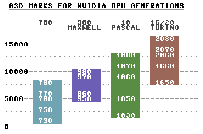
There’s a truckload of different Nvidia GPUs around and new ones might be right around the corner this year again. As a consumer it’s been kinda hard for me to compare between old and new generations and figure out whether an update would be worhtwhile. In addition to brand new products, there’s a rather big second hand market, where you might land great deals on aged but still usable cards. Here’s a rough visual view to the last four generations based on G3D Marks:
Plain PETSCII viewable on a real C-64 🙂
This kind of overview can never be really accurate, as there are all sorts of OC/Ti/Super models of GPUs (omitted here), newer cards may have features that the older ones lack and so on. Drivers, games, overclocking and cooling are some more variables that aren’t really present here. The very benchmark used here might not be the best available, but intuitively the figures seem about right (except for the 1030, which might be skewed by the DDR4 models). At least the graph should provide a quick idea with regard to upgrades: would it make a notable difference to switch or not?
Olipa siinäkin taas vuosi. Päällimmäisenä mieleen ovat jääneet monenlaiset velvoitteet, kahden työn välillä pomppiminen sekä lähes krooniseksi kääntyvä uupumus. Muuttaminen on aina raskasta puuhaa, ja vaikka vaihdoimme vain kämppää samassa talossa, niin melkoinen huhkiminen siihenkin tarvittiin. Ei vuosi toki mitään pelkkää kurjuutta ollut: muksuista on alati iloa – jos sitten lisästressiäkin – ja tutkimuksen saralla monenlaista tuli valmiiksi. Harrastuksille on jäänyt aikaa vaihtelevasti, mutta näistä kaikista tarkemmin sitten omissa kohdissaan.
Töiden paiskintaa
Kahden vuoden puolipäiväinen postdoccini pelikulttuurien tutkimuksen akatemiahankkeessa tuli juuri loppuunsa, joten nyt on palattava täysipäiväisesti opetushommiin Aallossa. En toki ole lopettamassa tutkimuksen tekemistä mihinkään ja pysyn hankkeessa roikkumassa edelleen jollain nimikkeellä, vaikka palkka lakkaakin juoksemasta. Ajan jakaminen kahden työpaikan välillä ei ole ollut mitenkään helppoa, ja opetustehtävien pakottavan luonteen vuoksi tutkimus on usein joutunut väistämään. 2018 oli aika kuiva julkaisujen suhteen, mutta viime vuonna pitkään limbossa roikkuneita papruja tuli pihalle peräti oikein mukavasti. Tässä näitä tärkeimpiä:
Olen laiska kirjoittelemaan mitään yksinäni, joten suurin osa on yhteisjulkaisuja muiden kanssa. Musiikissa julkaistun träkkeripläjäyksen tein kuitenkin ihan peräti itse. Yksin kirjoittamisessa on joitakin selviä etuja, kun muutoksia voi tehdä nopeasti, eikä erilaisia tyylejä tarvi sovitella yhteen. Toisaalta motivaatiota on vaikeampi pitää yllä, kun kaikesta on vastuussa lähinnä itselleen.
Skenepuuhat
Tämä puoli oli jälleen hieman paitsiossa, mutta eipä sentään kokonaan. Suurin osa skenetyksestäni keskittyi jälleen PETSCII-grafiikan ympärille muodossa tai toisessa: sain aikaiseksi jokusen kuvan ja pitkästä aikaa myös entistä ehomman version editoristani. Samoille “markkinoille” tuntuu olevan jo kovasti tunkua, mutta ainakin toistaiseksi näkisin, että omassa kikkaleessani on sujuvin työnkulku, kunhan vaan jaksaa opetella niitä pikanäppäimiä. Ainoa varsinainen koodaamani demo oli Vammala Partyille Processingilla väsätty Machine Make Machine, jota ei tosin sen virallisemmin julkaistu.
Hieman meta-skenetyksen puolelle menee vuoden toinen merkkipaalu, demoskenen hakemus kotimaiseen elävän kulttuuriperinnön luetteloon. Suomen hanke on osa isompaa kokonaisuutta, jonka tavoitteena on saada demoskene UNESCO:n aineettoman kulttuuriperinnön listalle. Oman osuuteni työryhmässä piti alkujaan olla pieni, mutta lopulta päädyin kirjoittamaan lähes koko hakemuksen ja hankkimaan sille tukijatkin. Katsotaan, miten käy!
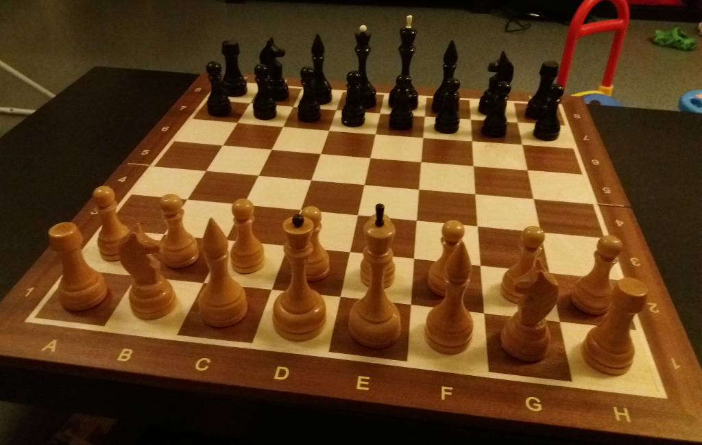
Shakkivuosi
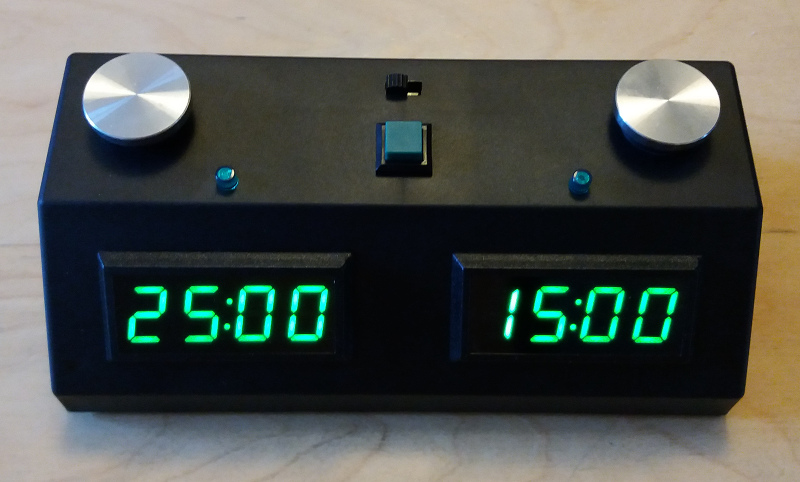
Innostus ja omat kyvyt ovat aaltoilleet stressitason mukaan, mutta shakkia tuli harjoiteltua ja pelattua jälleen verrattain ahkerasti. Osallistuin laskujeni mukaan ainakin neljään viralliseen kilpailuun ja päälle vielä puistoshakin Helsingin mestaruuskisoihin. Mitään sanottavaa menestystä ei edelleenkään herunut, mutta vahvuuslukuni (Selo) lipsahti sentään 1400:n päälle ja pari kertaa voitin jopa selvästi vahvempia pelaajia. Nurkissa alkaa olla jo sen verran paljon välineistöä, että koitan hillitä enimpiä hankintoja – toki perheeseen silti ilmaantui taas muutamat uudet napit sekä laudat, ja vissiin pari shakkikelloakin.
Tärkeämmässä roolissa olen joka tapauksessa ollut perheen varsinaisen lahjakkuuden huoltajana. Poitsu kuskasi tänä vuonna kotiin peräti kolme SM-mitalia, joista viimeinen oli se pitkään odotettu kulta koululaisten SM-kisoista Espoosta. Lisäksi pikashakista hopeaa keväällä ja nuorten SM:istä pronssia. Näiden ansiosta aukesi samalla mahdollisuus osallistua kansainvälisiin kisoihin, joihin ei vielä kuitenkaan pystytty repeämään aikataulujen takia. Vuosi loppui vielä mukavasti pääkaupunkiseudun tokaluokkalaisten jaettuun koululaismestaruuteen. 2020 tulee olemaan jälleen se vaikeampi joka toinen vuosi, kun samassa sarjassa ovat vastassa vuotta vanhemmat pelaajat.
Koneiden koppulointia ja hieman käyttöäkin
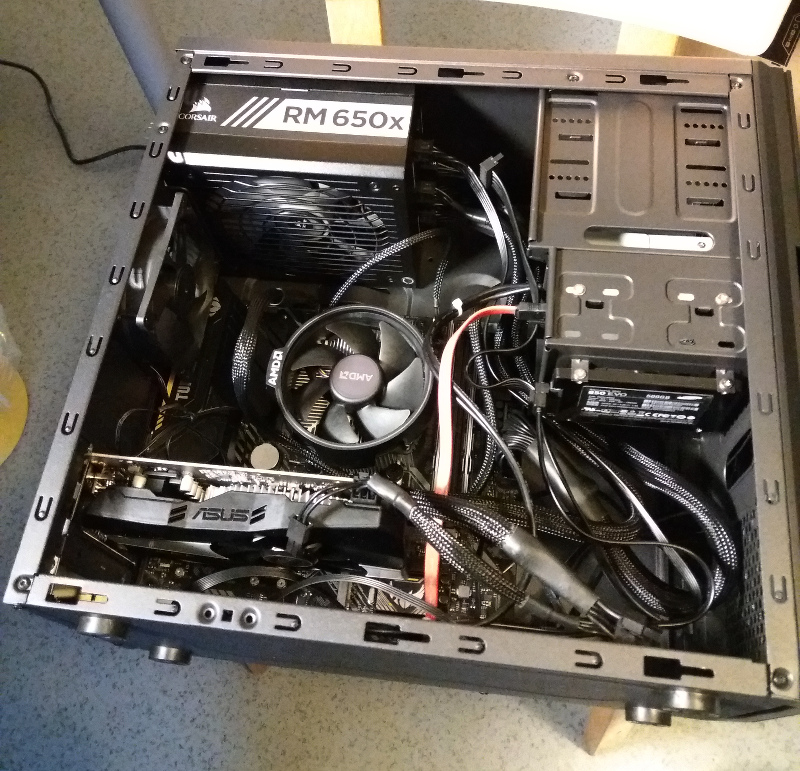
Huomattavan suuri osa vapaa-ajasta on seonnut tietokoneiden ja niiden ohjelmien säätämiseen. Tällä erää ei niinkään retroraudan äärellä kuten yleensä, vaan pikemminkin kohtuullisen tuoreiden PC-koneiden. Satunnaisesta päähänpistosta keväällä alkanut koneprojekti kasvoi lumipallon lailla, ja lopulta kaikki perheen käyttökoneet menivät vaihtoon. Osa virittelystä on ollut hieman tuskallista (ja kallista) kantapään kautta opettelua, mutta suurelta osin ihan hauskaakin, ja tunnen nyt olevani paremmin kartalla muisteista, näyttiksistä, prosuista ja muista nykytekniikan ihmeistä kuin pitkään aikaan.
Käytettyjen bisneskoneiden kunnostus ja myynti nousi 2019 entistä näkyvämmäksi kotimaisen tietoteollisuuden haaraksi, ja samoista markkinoista kamppailevat jo varmaankin kymmenet yrittelijät; katsotaan nyt sitten, alkavatko jossain vaiheessa pudotuspelit. HP:n raatoja meillekin hankittiin edullisuuden ja luotettavuuden nimissä, vaikka näin jälkiviisaana olisin ehkä tehnyt toisin, sillä merkkikoneiden laajennettavuus on vähän niin ja näin.
Alati kehittyvä Proton osoittautui isoksi jutuksi Linux-pelaajalle, kun ennen hankalan tunkkauksen takana olleet tuhannet Windows-pelit tulivat helposti saataville Steamin kautta. Vuoden merkittävimpiä kokemuksia olivat etenkin Inside sekä joskus ammoin hankkimani Tales of Monkey Island -sarja. Samalla vauhdilla rupesin hakkaamaan läpi muitakin Mankeja, eikä jäljellä ole enää kuin Escape, jonka karu 3D-grafiikka ja etenkin kankea ohjaus ovat toistaiseksi onnistuneet viivyttämään maaliin pääsyä.
Leffat: sitä sun tätä
Shakki- ja lännenelokuvien vahtaaminen on jatkunut yhä, tosin aiempaan verrattuna jokseenkin säästöliekillä. Näistä saattaa taas joskus päätyä jotain julkaisuksi asti, kunhan sopiva tilaisuus tarjoutuu. Noin muuten ruudulla on pyörinyt jälleen paljon scifiä ja ihan vuoden loppua kohti hieman pukudraamaakin (Ylpeys ja ennakkoluulo -BD on tulossa postissa). Uusien sisältöjen haalimisen sijasta olen palaillut jälleen myös vanhojen klassikoiden äärelle: Alien toimi edelleen kuin häkä, vaikka Scottin myöhemmät yritelmät kuinka hyvänsä ovatkin yrittäneet paskoa sarjan maineen 🙂
Länkkärivuoden parhaita aiemmin näkemättömiä teoksia oli tuoreehko The Sisters Brothers. Pitkään odottanut The Ballad of Buster Scruggs pitää nähdä viimeistään tänä vuonna – sopiva tilaisuus voisi olla vaikkapa kevään länkkärimaraton. Maratonit pyörivät vanhaan malliinsa ja katsojamäärä oli sikäli korkea, että eiköhän tuokin perinne tule hengissä pidettyä. Scifin puolella Aniara oli vaikuttavan kyyninen kuvaus ihmismielestä, ja jostain syystä aikanaan täysin ohi mennyt Moon sekin vuoden parhaita kokemuksia. Eräänä sivujuonteena katsastin vielä rillumarei-elokuvat.
Semmosta. 2020 pitää yrittää huolehtia hieman paremmin niin fyysisestä kuin psyykkisestäkin terveydestä – enemmän lepoa, jos vain suinkin mahdollista ja vähemmän stressaavaa silppua. Parempaa vuotta ja jaksamista kaikille muillekin ryytyneille!
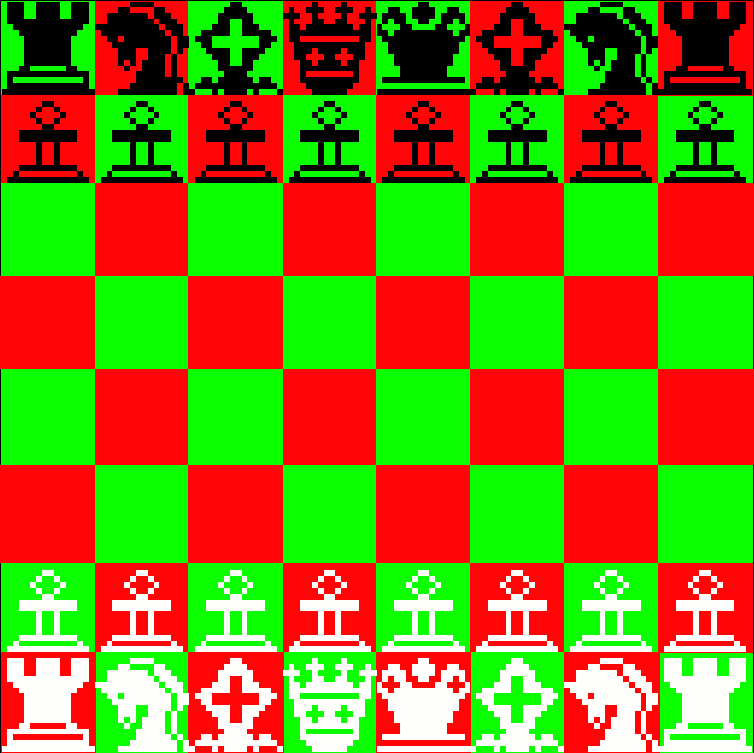
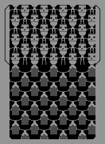
If you’ve ever looked into the second character set available on non-Japanese versions of Sharp MZ computers, such as the MZ-700, you’ve probably noticed how there’s an absurd collection of various game characters, such as smiling and grumpy faces consisting of four blocks. Since you couldn’t display pixel graphics before the PCG extension or the MZ-800, the engineers tried to soften the blow by offering some possibly useful bits and pieces for games. Among the curious mess there’s also a full 2×2 chess set. Here’s a quick mockup of how the board would have looked like (thanks to Tero for finding the combinations and the tip about Tiled).
One possible set of colors, Sharp has as many as eight to choose from(!).
The queen has a weird look on her face, so using the pedestal from the king would probably look better. Likewise, there are prettier combinations for the pawns if you make the knob out of two filled half-circles. Some of the pieces could accommodate stretching to 2×3 blocks, but probably not all of them.
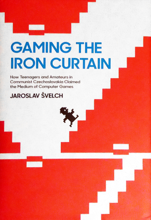
Jaroslav Švelchin Gaming the Iron Curtain: How Teenagers and Amateurs in Communist Chzechoslovakia Claimed the Medium of Computer Games on kiintoisa kurkistusikkuna rautaesiripun takaisen 1980-luvun Tšekkoslovakian tietokoneharrastajien elämään. Retroaiheisia kirjoja julkaistaan tällä hetkellä ennennäkemätöntä tahtia, ja suuri osa niistä on värikkäitä kepeitä “kahvipöytäkirjoja”, joiden äärellä voi nostalgisesti bongata nuoruutensa laitteita tai pelejä. Tämä opus edustaa kirjon toista ääripäätä, akateemista aiheen tutkimusta, mistä kertoo osaltaan myös arvovaltainen julkaisija MIT Press.
Manic Miner -henkinen kansi.
Siinä missä länkkärit saattoivat – rahojen salliessa – marssia kauppaan ostamaan itselleen kotitietokoneen, kamppaili Itä-Euroopan harrastaja monenlaisen niukkuuden parissa. Oma kansallinen mikrotietokoneiden tuotanto oli pitkään suunnattu lähinnä koulukoneisiin eikä muutenkaan riittänyt kattamaan suurta kysyntää, joten laitteita (etenkin Spectrumeja) on muiden saantikanavien lisäksi salakuljetettu ulkomaankomennuksilta. Pelit ovat puolestaan levinneet kopioina kaseteilla paljon helpommin kerhojen ja tuttujen välityksellä, ja rautaesiripusta huolimatta harrastajilla on ollut laajoja piraattipelikokoelmia. Tietokoneohjelmia koskevaa lainsäädäntöä ei ensinnäkään ollut olemassa, minkä lisäksi itäblokissa läntisten tuotteiden oikeuksia tuskin olisi muutenkaan varjeltu.
Vaikka järjestelmä ja paikka olivatkin kovin erilaiset kuin vaikka koto-Suomessa, ei kaikki sivuilla vastaan tuleva vaikuta kovin eksoottiselta. Pelejä kopioitiin ahkerasti täälläkin ja myös keskustelut kotitietokoneiden “hyödyllisistä” käyttökohteista ovat tuttua kauraa. Kerhoja oli meilläkin, tosin Tšekkoslovakiassa niiden rooli näyttää olleen huomattavasti suurempi, minkä lisäksi ne usein toimivat (ainakin nimellisesti) puolisotilaallisten järjestöjen kuten Svazarmin alaisuudessa. Tietokonelehdistön puuttuminen on ainakin todellinen ero: meillä Printti, C-lehti ja etenkin MikroBitti olivat laajasti luettuja merkittäviä toimijoita tietokoneharrastuksen piirissä. Lehdistön tarvetta paikkasivat Tšekkoslovakiassa kerhojen jäsenlehdet, joista suosituimmat levisivät varsinaisten kerhojen ulkopuolellekin.
Vaikka kirja onkin akateeminen, ei se ole mitenkään raskasta luettavaa tai yliteoreettinen. Jo alusta asti itselleni tuli vahva tuttuuden tunne, sillä lähestymistapa muistuttaa Petri Saarikosken Koneen Lumoa (2004), joka käsittelee suomalaista tietokoneharrastusta (nykyään ladattavissa ilmaiseksi täältä). Painetun kirjan lisäksi Švelch on laittanut linjoille monenlaista mielenkiintoista lisämateriaalia valokuvista peleihin, joihin voi tutustua osoitteessa http://ironcurtain.svelch.com/. Tällaisia kirjoja lukisi mielellään lisääkin, joten toivottavasti muut tietotekniikan paikallishistorian tutkijat inspiroituvat Gaming the Iron Curtainista ja tuovat omien maidensa kulttuuria samalla tavoin julki.
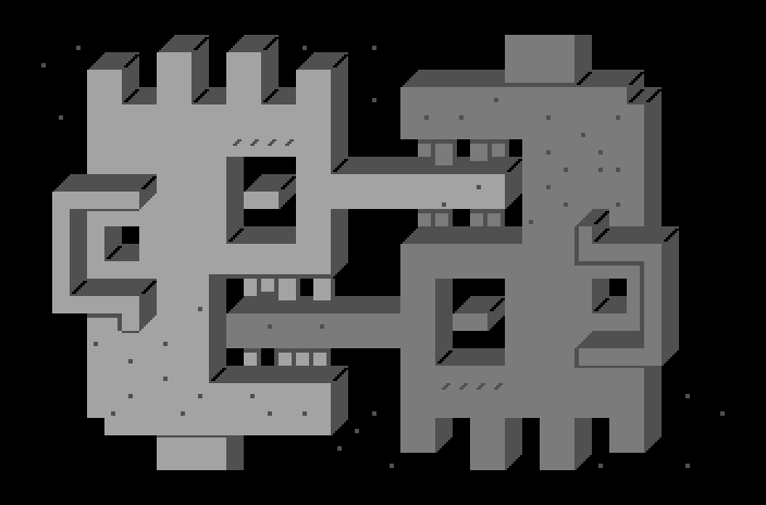
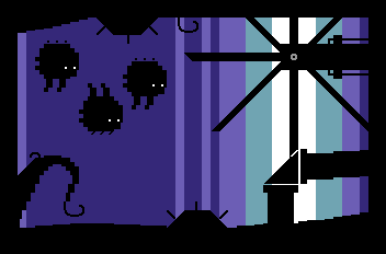
Tänä viikonloppuna pidettiin taas Zoo-party Akaan Viialassa. Oli tarkoitus mennä paikalle toki, ja lippukin oli jo ostettuna, mutta miesflunssa iski päälle äärimmäisellä tarkkuudella niin, että kotiin oli jäätävä. Kyhästin sentään räkäisenä pari kuvaa kovatasoiseen PETSCII-kilpailuun:
Limpo
Revenge!
Limpo on, kuten arvata saattaa, yritys sovittaa Limbon grafiikkaa merkkimuotoon. En sentään ruvennut laiskasti konvertoimaan ruutukaappausta, enkä edes piirtänyt läpi, vaikka referenssikuvaa tuli tietysti vilkuiltuakin. Taustan utuisen valohämyn kanssa piti nostaa kädet pystyyn välittömästi, joten tein sitten tavanomaisen “gradientin” palkeista – minkäänlainen muu ditherointi palikkaresolla näyttää yleensä karulta. Ukkeli osoittautui sekin haastavaksi tuossa koossa, mutta tuli siitä riittävän tunnistettava, vaikka tukka näyttääkin lähinnä lippikseltä. Olin niin tyytymätön lopputulokseen, etten aluksi meinannut laittaa koko tekelettä edes kompoon. Täytemateriaalilla on kuitenkin oma arvonsa kompon hengissä pitämisessä, eikä minulla ole mitään varjeltavaa graafikon mainettakaan, joten sinne vaan 🙂
Oikealla näkyy puolestaan Revenge!, jota olin suunnitellut jo pidemmän aikaa ja hiukan luonnostellutkin paperille. Suunnitelmat menivät tuttuun tapaan uusiksi, kun totesin, etteivät ukkelit mahdu ruudulle ollenkaan; 40×25 merkkiä on tällaiselle palikkaiselle pseudo-3D:lle kovin vähän tilaa. Yin/yang-hengessä toisen naaman piti olla musta ja toisen valkoinen, mutta idea ei oikein toiminut käytännössä. Räpläsin värejä moneen kertaan uusiksi, kunnes lopulta oli pakko valita “helppo” reitti varjostuksen vuoksi, ja lopputuloksesta tuli harmaa – muille sävyille ei oikein ole sopivia liukuja olemassa.
edit: Arvaamatonta on yleisö… Kuvat peräti 4. ja 7.
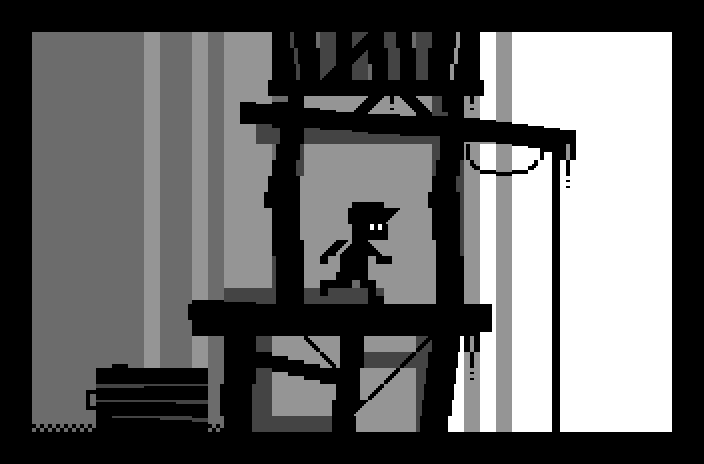
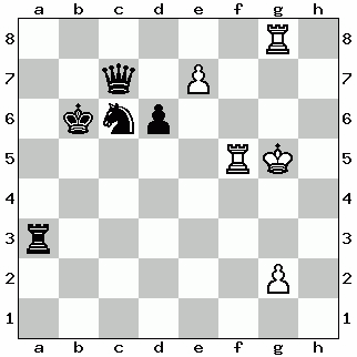
Ever wondered how the chess game at the end of Triton’s old MS-DOS demo Crystal Dream 2 goes? If yes, I’m here to help! Can’t say for sure if the chessboard colors and orientation are right, but assuming they’re correct, here’s my best bet:
Black wins.
White has a losing position, with a rook against a queen and a piece down. The only hope of winning or even drawing is lost on the first move, when black captures the passed pawn with the knight and forks the rooks at the same time. White tries to pin the knight in front of the queen to save the other rook, but an in-between check breaks the pin. After losing the rook for a knight White’s position is hopeless, and he/she just aimlessly walks around with the king to avoid constant checks, until checkmated.
Viikonloppuna pidettiin taas Vammala Partyt – Ikaalisissa. Ohessa omia kilpailutuotoksiani sekä Emilin PETSCII-kuva (Monster). Ajettavassa muodossa CSDb:n partysivulla. Menestystä ei kompoissa irronnut, lukuun ottamatta YouTube-mashuppiani Slapsticksucker. Processingilla väkästettyä Demoa (Machine Make Machine) tuskin julkaistaan tuossa muodossaan sen virallisemmin, mutta itse effu nähnee vielä käyttöä joskus.
Jos jotain olen tutkimuksen parissa oppinut, niin sen, että minkään asian kutsuminen ensimmäiseksi on vaarallista. Ensinnäkin on aina mahdollista, että myöhemmin löytyy joku vielä aikaisempi, tuntematon edeltäjä, jolloin väite muuttuu virheelliseksi. Toisekseen jonkin asian “ensimmäisyys” on usein pikemminkin määrittely- kuin faktakysymys. Tähän asiaan törmäsin hyvin konkreettisesti etenkin kirjoittaessani varhaisista suomalaisista peleistä (Peliteollisuus-artikkeli ja Chesmac-pätkä).
Mainosmiehiä ja raflaavia juttuja etsiviä toimittajia eivät tällaiset tutkimuseettiset kysymykset tietysti juuri liikuta, eivätkä he sen puoleen yleensä ole edes käsiteltävän aiheen asiantuntijoita. Mistä pääsemmekin tämänkertaisen ärsyyntymiseni juurille:
N2 (Facebook): “Linda tunnetaan mm. Hello Ruby -kirjasarjan äitinä, joka on maailman ensimmäinen lapsille suunnattu ohjelmointikirjasarja.”
Lähes kuka hyvänsä 80-luvulla kotitietokoneilla ohjelmoinut muistanee, etteivät lapsille ja aloittelijoille suunnatut ohjelmointikirjat olleet mitään harvinaisuuksia tuolloin, 30 vuotta sitten. Tunnetuimpia aikalaisia olivat Usbornen kirjat, joista on suomenkielisiäkin käännöksiä. En usko, että kirjailija itse on näiden “maailman ensimmäinen” -höpöjuttujen takana, vaan kyse on pikemminkin simppelistä myynninedistämisestä – konsulttiputiikki myy puhujia, Otava kirjoja, ja media halajaa klikkauksia.
Pelimuseon levynkansinäyttelyyn liittyvä PETSCII Disk Cover Competition päättyi juuri, ja tuttuun tapaan nepa-artistit olivat vääntäneet kilpailuun toinen toistaan komeampia ja kekseliäämpiä teosta. Vaikka työtapa olikin vapaa, niin oma edikkani oli ainoa valmiiksi tuettu, sillä sille oli valmis asetustiedosto ja pohja, jonka päälle omaa tekelettään pääsi väkertämään. Ihan kaikki graafikot eivät näemmä levynkannen ideaa ymmärtäneet, ja jokunen venytti sääntöjä oman makunsa mukaan, mutta eipä tämän mitään haudanvakavaa puurtamista pitänytkään olla.
Perinteinen levynkannen formaatti on ollut mustavalkoinen A4, joka on ollut helppo tykittää eteenpäin valokopiokoneella ilman laadun merkittävää kärsimistä. PETSCII:llä piirtäessä eräs ilmeinen haaste on se, että toinen puolisko pitää piirtää ylösalaisin, jolloin ei voi käyttää esimerkiksi normaaleja kirjaimia. Editorini pyöritys- ja peilaustoiminnot helpottavat hommaa, mutta suunnittelu on silti tärkeää. Puoliskot voi toki tehdä itsenäisinä kuvinaan, mutta hyvää karmaa ansaitsee sillä, jos kaksipuolisuutta saa jotenkin nokkelasti hyödynnettyä. Itse ainakin yritin, oma tekele We’re one, but we’re the same (Bartman grew up) alla:
Jokavuotinen kesäparty on taas kunnialla lusittu, vaikka hiukan raatoisa olo vaivasikin jo ennen ja etenkin jälkeen – helleaalto osui tälläkin kertaa juuri tuohon viikonloppuun, joten hiki on ollut ja nukkuminen vähän niin ja näin. Luovaa aikaa oli seonnut melkoisesti uuden kameli.net-serverin asennukseen, mutta palaan siihen aiheeseen myöhemmin. Merkittävin saavutukseni tällä erää lienee levykkeenheittokilpailun voitto, sillä onhan viime kerrasta jo useita vuosia. 90-luvulla ja vielä 2000-luvun alussa olin aina kärkikahinoissa, mutta uusien kilpakumppanien ja oman kangistumisen myötä sijoitukset ovat olleet heikompia. Skenekompoihin tein kiireessä kaksi nepakuvaa, Kafkis (hires Multipaintilla) ja Posandeerit (PETSCII omalla edikalla), sekä Yzin kanssa vielä Tiskari-vitsidemon, joka sitten sattui voittamaan komponkin. Emil osallistui Lumpeet-kuvalla, joten perheestä oli myös muuta edustusta.
