Posts filed under 'retro'
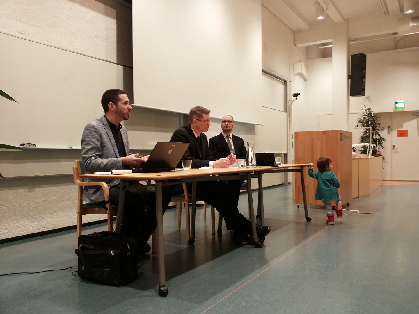
Flunssasta huolimatta sain eilen hoidettua pois tohtorintutkinnon viimeisen etapin, kun puolustin väitöskirjaani Porin yliopistokeskuksessa. Tilaisuus oli pieni ja kotoisa, eikä vastaväittäjä, Carl Therrien, heittäytynyt häijyksi, mutta onneksi haastetta hiukan lisäsi päällä jyllittävä nuha, jota koitin lääkitä Ibumaxin ja Mynthonin keinoin. Kokoversio väikkäristäni, Times of Change in the Demoscene: A Creative Community and Its Relationship with Technology, on nyt ladattavissa linkin takaa – yliopiston sivuilla olevasta puuttuvat itse artikkelit. Idakin osallistui:
February 18th, 2017
Jos oli 2015 stressaava, niin eipä viime vuosikaan yhtään sen helpompi; ehkä jopa tuskaisempi. Tavanomaisten duunin ja vanhemmuuden velvoitteiden lisäksi niskassa painoivat entistä pahemmin opintojutut, kun opinnäytteen väsäily ja siihen liittyvät moninaiset prosessit alkoivat tulla loppusuoralle. Taustalla yleistä ankeutta on lisännyt se, kuinka jotkut ovat ilmeisesti menettäneet kaiken kosketuksensa todellisuuteen ja käyttävät kaikki liikenevät voimansa moninaisen vihapuheen suoltamiseen netin (tai presidentinvaalikampanjan) täydeltä.
Ei vuosi sentään ihan pelkkää kurjuuttakaan ole ollut. Juniori on kasvanut ja oppinut kaikenlaisia taitoja, ja tulihan tässä tosiaan täytettyä tasavuosiakin. Länkkärimaratonit ovat järjestelyvaivasta huolimatta edelleen vuoden valopilkkuja. Tunnelma on tässä vaiheessa varovaisen toiveikas, sillä tänä vuonna velvoitteiden pitäisi lopulta jo hieman hellittää.
Skenetykset ja retroilut
Valitettavan hiljaista tällä saralla, vaikka Vammala Partyä varten tuli sentään huhkittua oikein tosissaan: neljä kuvaa, kaksi pikku demoa ja vieläpä interaktiiviseksi muutettu 80-luvun sarjis, johon palaan joskus myöhemmin, kun projekti etenee. Mukana menossa tuttuun tapaan myös Roz, Dr. TerrorZ sekä Yzi. Assemblyille teimme pienen paluun dossille: Amica Magick on vähän mitä on, mutta ainakin kääntäjät ja muut ovat taas todistettavasti kunnossa. Manun kanssa kyhätyn C-visan voinee laskea produksi senkin.
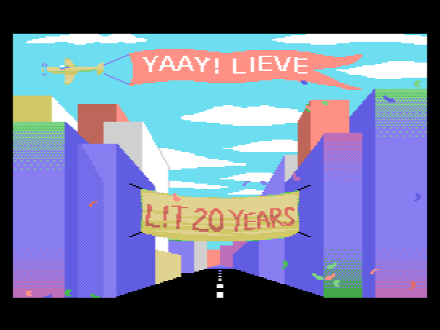
MSX-ryhmämme Lieves!Tuore täytti jo 20 vuotta, mitä juhlistettiin asiaankuuluvasti Vammala Partyillä. Paikalle saatiin suuri osa jäsenistä – ainakin kaikki aktiivit. Jalkapalloharkkojen jälkeen 1996 perustettu retroryhmä osoittautui muita aikalaisvitsejä kestävämmäksi, eikä lopahtamisesta ole merkkejä näkyvissä edelleenkään. Alun perin funtsimme, että vuosijuhla pidettäisiin oikeasti Lievestuoreella, mutta ideasta oli kuitenkin käytännön syistä luovuttava.
Skenetyksen ja yleisen retroilun välimaastoon sijoittuva Pixel Polizei -konvertteri tuli julki vuoden alussa. Työkalusta ei tullut mikään varsinainen hitti, ja työmääräkin osoittautui aivan kohtuuttomaksi, joten olkoon nyt jonkun aikaa hyllyllä odottamassa aikaa parempaa. Tulipa ainakin opittua kaikenlaista eri kasibittikoneiden ohjelmoinnista ja grafiikkatiloista. Tuunasin PETSCII-edikkaakin huomattavasti, vaikka suurin osa sisäisistä muutoksista ei juuri käyttäjälle näykään. X-partyn vaatimattomaksi jääneessä kompossa ilmeisesti kaikki kuvat olivat edikkatekeleitä, joten tarkoitus sinänsä täyttyi.
Konekanta ei juuri muuttunut – retroroinaa on muutenkin jo niin paljon, ettei lisää oikein pysty hankkimaan. Loppuvuodesta tilasin sentään XE-Atareille sopivan ulkoisen muistinlaajennuksen, joka on saanut toistaiseksi odotella sopivaa hetkeä (mitään varsinaista tarvetta ei ole, kun 600XL:ni on jo laajennettu). Noin muuten vuoden tietokonevirittely kohdistui lähinnä Linux-läppäreihin.
Tutkimustohinat
Artikkelit, lehtijutut ym. jäivät 2016 vähäisiksi, vaikkakin perustellusta syystä. Merja Salon kanssa sentään saatiin julkaistua kepeä katsaus suomalaisesta Amiga-pioneerista, sekä Terpan kanssa Skrollissa PETSCII-juttu. Artikkeleita on toki jatkuvasti tekeillä ja pari vertaisarvioinnissakin, mutta katsotaan nyt, miten niiden kanssa käy.
Suurin osa kirjoitus- ja tutkimustyöstä on kohdistunut kiviriippaan nimeltä väitöskirja. Keväällä oli sopivasti noin kuukausi aikaa kirjoitteluun ja väänsin nippuväikkärin johdantoa kasaan sivun päivässä – toisinaan inspiraation ja toisinaan riittämättömyyden tunteen vallassa. Tässä vaiheessa lopussa ovat niin motivaatio, kunnianhimo kuin yleinen häveliäisyyskin, joten ihan hyvä, että myös projekti on lopuillaan. Esitarkastajilta tuli sekä tukistusta (ihan aiheesta) että kiitosta, ja kun molemmat ehdottivat työn hyväksymistä, niin korjailujen jälkeen puolustanen opinnäytettä 17.2. Porissa.
Leffavuosi
2014 ja 2015 olivat hulppeita länkkärivuosia: katselin yli 150 näkemätöntä westerniä molempina vuosina, mutta nyt tahti on lopulta hiipunut. Yhtäältä järkevä katseltava on käynyt vähiin ja toisaalta olen katsellut vaihteeksi muitakin genrejä. Ihan tarkkaa lukemaa ei ole, mutta aiemmin näkemättömiä tekeleitä kertyi listaan hiukan reilu 60 kappaletta. Uudet ison rahan tuotannot, kuten Diablo, Jane Got a Gun ja The Magnificent Seven todistivat vahvasti länkkärien uuden tulemisen puolesta, vaikka teoksina eivät järin ihmeellisiä olleetkaan.
Leffavuoden eräs kohokohta oli tietysti McCabe & Mrs. Millerin Blu-ray-julkaisu, jota oli povattu ja kytätty jo vähintään parin vuoden ajan. Olen hehkuttanut leffaa epäilemättä kaikille jo ihan tarpeeksi, mutta kyllä se edelleen kesti uudelleenkatselun (tai pari) oikein mainiosti. Harvempi länkkäri on vastaavalla tavalla kokonaisteos, jossa juoni, hahmot, ympäristö ja lavasteet kaikki kietoutuvat kiinteästi toisiinsa (no niin, hehkutinpa taas).
Muu katselu keskittyi keväällä uusiin ja vanhoihin scifi-leffoihin – Alienit, Predatorit, Martianit, Interstellarit, Gravityt sun muut – ja jossain määrin fantasiaan Lortista Hobittiin. Olin nähnyt joskus taannoin pari ensimmäistä Harry Potteria, mutta sarja ei tuolloin juuri kiinnostanut. Nyt uudella yrityksellä ja kokoelmaboksin voimin sain huispaukset huispattua hamaan loppuunsa. Putkeen katsomisesta seurasi tunne, että jokainen episodi on oikeastaan sama leffa vähän eri paketissa. Oculus reparo! Kummallisemmista sivujuonteista mainittakoon tässä vielä sotilasfarssit.
-

-
M-arquero (PETSCII)
-

-
Sommaren e kårt (C-64 multicolor)
-
-
Luikero (PETSCII)
-

-
Alakis (MSX-demo)
-

-
-
-
-
Siinä se nyt on ihan todistettavasti.
-

-
blu-ray
-
-
Map 1.0
-

-
Arnold Schwarzenegger in Cactus Jack (1979)
-
-
Tyttö lähtee kasarmiin
January 1st, 2017
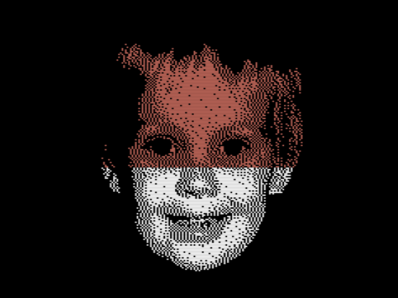
Tämäkin stressintäyteinen vuosi on tulossa lopulta päähänsä, joten nyt on aika yrittää hieman levätä. Retrospektiivi tulee joskus lähipäivinä, mutta tässä vaiheessa jouluntoivotukset (kuvaa klikkaamalla saa näytille muutaman raamin animaation):

Tätä voi katsella oikeallakin nepalla: http://www.kameli.net/~marq/joulu2016.prg
Tai Plus/4:llä: http://www.kameli.net/~marq/joulu2016plus.prg
December 23rd, 2016
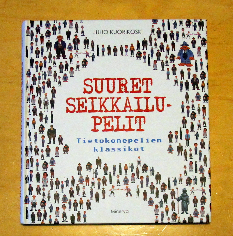
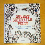
Juho Kuorikosken Suuret seikkailupelit: Tietokonepelien klassikot on eräänlainen jatko Sinivalkoiselle pelikirjalle, vaikka tällä kerralla ei pitäydytäkään Suomen kamaralla. Sen sijaan Kuorikoski käy läpi seikkailupelien historiaa alkaen tekstiseikkailuista ja päätyen tämän päivän visuaalisesti komeisiin “vuorovaikutteisiin elokuviin”. Pelkkien pelien lisäksi lähdemateriaalissa on runsaasti haastatteluja, joissa pääsevät ääneen aikansa tunnetuimmat suunnittelijat ja koodarit, kuten Al Lowe ja Ron Gilbert.
Suuri osa sivuista on luonnollisestikin omistettu Sierran ja LucasArtsin tunnetuimmille klassikkosarjoille King’s Questista Monkey Islandiin. En itse tunne seikkailupelejä sen syvällisemmin, joten valikoima vaikuttaa varsin kattavalta (noh, Shenmueta jäin kaipaamaan). Kuorikosken keskeinen narratiivi on se, kuinka seikkailupelit kehittyivät näkyväksi ja kaupallisesti menestyneeksi genreksi 80-luvun lopussa ja kuinka ne katosivat 90-luvun lopulla valokeilasta moniksi vuosiksi. Lopputulema on kuitenkin optimistinen, sillä hiljattain lajityyppi on kokenut jälleen uuden tulemisen.
Kirja on helppoa luettavaa ja toimii sekä hyvänä ajanvietteenä että yleisjohdatuksena aiheeseen. Kuorikoski tuntee aiheen kattavasti, mutta mikään tiedekirja Suuret seikkailupelit ei sittenkään ole – kirjoittaja ei peittele omia mieltymyksiään ja suosikkiteokset saavat osakseen ylisanoja. Eräs kirjasta selkeästi esiin nouseva seikka on se, kuinka seikkailupelit ovat olleet alusta saakka sarjoja: menestyneitä konsepteja on lypsetty vuosien varrella moneen kertaan jatko-osien ja uusioversioiden muodossa (juuri tästähän nykyistä peliteollisuutta kritisoidaan, mutta jatko-osatehtailu on kirjan perusteella paljon vanhempi ilmiö).
November 28th, 2016
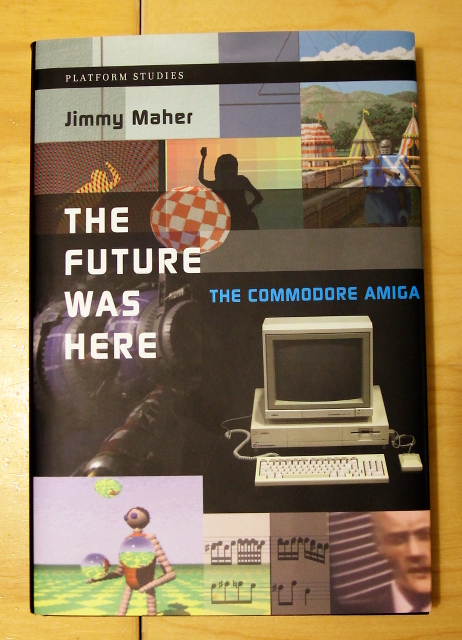
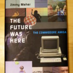
Jimmy Maherin The Future Was Here – The Commodore Amiga vuodelta 2012 on toinen lukemani Platform Studies -sarjan kirja. Atari VCS -kirjan tapaan teoksessa avataan laitteiston erilaisia ominaispiirteitä tapausesimerkein eikä esim. kullekin piirille omistetun luvun kautta. Lähestymistavan hyviä puolia ovat ainakin mekaanisuuden välttäminen sekä ohjelmien ja laitteiston välisen suhteen korostaminen. Ilmeisenä haittana tästä seuraa tietysti se, että missään ei ole kootusti tietoa yksittäisen piirin ominaisuuksista. Platform Studies -kirjoja voisi kenties luonnehtia populaaritieteeksi: ne eivät ole yhtä tiukan akateemisia kuin vaikkapa väitöskirjat, mutta toisaalta ne poikkeavat myös hiljattain yleistyneistä ns. kahvipöytäkirjoista, jotka herättelevät värikkäillä kuvillaan lukijoissa nostalgiaa.
Kirja painottuu erityisesti Amigan varhaisvuosiin, jolloin plattis oli kilpailijoihinsa nähden huomattavan innovatiivinen monessakin suhteessa. Commodoren myöhemmistä seikkailuista, kuten AGA-Amigoista tai CD32:sta ei sanota juuri mitään, ja kolmansien osapuolien tekemistä turboista ym. laajennuksista vieläkin vähemmän. Bisneksensä tyrinyt Commodore saa kuulla tuttuun tapaan kunniansa, kun taas alkuperäisten suunnittelijoiden osaamista hehkutetaan toistamiseen. Hieman tuoreempana näkökulmana Maher nostaa Amigan suljetun ja vaikeasti laajennettavan laitteiston yhdeksi tappion merkittävimmistä syistä.
Tarkemmin käsiteltäviä aiheita yleishistorian lisäksi ovat Boing-demo, Deluxe Paint, Juggler-demo, NewTek, AmigaOS/AREXX, kräkkeri- ja demoskene, Cinemaware ja Psygnosis. Boing ja Psygnosiksen ammuskelupeli Menace puretaan atomeiksi ja samalla havainnollistetaan laitteiston erikoisominaisuuksien kekseliästä hyödyntämistä niissä. Lukijalta vaaditaan jonkun verran teknistä ymmärrystä, vaikka esim. bittitasot on selitetty kansantajuisesti. Itselleni tekninen puoli oli jo aika pitkälti tuttua muutenkin, mutta ohjelmien ja firmojen taustoista löytyi paljon uutta mielenkiintoista tietoa.
November 9th, 2016
Pitkällisen lueskelun jälkeen sain loppuun Grant D. Taylorin kirjan When The Machine Made Art: The Troubled History of Computer Art, joka on tietämäni mukaan ainutlaatuisen laaja katsaus tietokonetaiteen historiaan. Käsittely on kronologista ja ulottuu ensimmäisistä tietokoneella tehdyistä kuvista suunnilleen vuosituhannen vaihteeseen saakka. Jo itse termi “tietokonetaide” viittaa historiaan – nykyäänhän puhutaan pikemminkin vaikka digitaalisesta tai (uus)mediataiteesta.
Läpitunkeva teema, joka näkyy jo kirjan nimessäkin, on tietokonetaiteen kohtaama vastustus. Jäin itse miettimään, että onko julkinen keskustelu todella ollut noin vihamielistä, mutta näkemystä on ainakin perusteltu monin esimerkein. Kritiikkiä on satanut sekä aiheellisesti että aiheetta monesta suunnasta: tietokonetaidetta on eri aikoina syytetty niin kaupallisuudesta, temaattisesta köyhyydestä kuin tekniikkakeskeisyydestäkin. Taylor tarjoaa syyksi yhtäältä sitä, että taidemaailma ei pitänyt tontilleen tunkevista tiedemiehistä, ja toisaalta tietotekniikkaa kohtaan tunnettuja yleisempiä epäluuloja.
Kenties suurin käänne tietokonetaiteen historiassa vaikuttaa olleen se, kun (suhteellisen) helppokäyttöiset valmisohjelmat tulivat taiteilijoiden saataville 80- ja 90-luvun kuluessa: musiikin ja grafiikan luominen ei enää vaatinut välttämättä syvällistä teknistä osaamista. Tämäkään suuntaus ei kaikkia miellyttänyt, vaan vanhan polven tekijät kritisoivat moista kyvyttömyyttä. Sittemmin kenttä monimuotoistui ja yhdistyi muihin taidemuotoihin niin pitkälti, ettei ole enää mielekästä puhua pelkästään tietokonetaiteesta, kun tietokone toimii keskeisenä työkaluna niin valokuva- kuin videotaiteilijoillekin.
Kirjasta löytyi joitakin eväitä myös demoskenen analysointiin. Olen jo pitkään pohtinut, onko demoskene pikemminkin moderni (tekijyys on keskeistä, töitä arvioidaan tiukoin kriteerein) vai postmoderni (kollaasit ja tyylillinen lainailu). Muun digitaalisen taiteen tapaan voitaneen sanoa, etteivät demot ole puhtaasti kumpaakaan, vaan niissä on piirteitä molemmista suuntauksista. Esimerkiksi 90-luvulla yleistynyt kerroksittainen “fotarimainen” valokuvien ja efektien yhdistely kytkeytyy laajempiin mediataiteen ilmiöihin sekä työkaluihin, ja kertoo osaltaan siitä, kuinka demoskene on kiinni ajassaan.
October 6th, 2016
I’ve been using various guesstimates throughout the years for the PAL MSX screen and pixel aspect ratios, but now there’s finally something credible instead (in contrast, NTSC machines have ~square pixels). According to this discussion thread, the pixels are as wide as 7:5 or, in other words, they are 1.4 times as wide as they are high. That’s pretty flat! I got almost same figures on my own Philips 1084S using a ruler, so they’re very likely correct. Other calculations:
- The pixel area of a 256×192 image is 5.6:3 — almost the same as a modern 16:9 screen
- That is a multiplier of 1.8666… for the image height to calculate the width
- In terms of square pixels 358×192 is very close, or with double pixels 717×384 even better
Viewing a borderless SCREEN 2 image fullscreen on a 16:9 screen gives a pretty good quick estimate of how it will look like. Two things to note are of course that people’s CRT displays are not perfectly calibrated, and that emulators do not use a correct ratio by default. In general horizontal stretching looks worse than vertical, which might be one reason emulators are a bit conservative with their aspect ratios; for example openMSX definitely produces a narrow image – even setting horizontal_stretch to its minimum value of 256 doesn’t make the image flat enough. Furthermore, Japanese Konami warez would appear unnaturally squeezed, even though that’s exactly how they were seen in Europe back in the day.
Square pixels vs. a corrected image:


edit: just as notes here some other numbers. Out of a 313 line full progressive PAL frame about 61.3% is spent on actual pixel lines, while the remaining 121 lines (38.7%) are for the border (113 lines) and vertical sync (8 lines). Dividing 3.58 MHz by 50 yields 71600 clocks per frame, but as a progressive frame is longer (49.92 Hz), the actual clocks are closer to 71700 per frame or 229 per scanline.
As shown by the IO demo, the exact cycles are not stable across machines, which makes it tricky to do splitting effects on an MSX1. IO uses a timing of 228 cycles/line or 71364 per frame, so those are probably the correct numbers on at least some machines.
edit2: Haven’t confirmed yet whether the MSX outputs 312 or 313 lines per frame, so the figures above are just estimates (there are some other possible error sources too). What is known is that the vertical blanking interrupt (VBI) takes place immediately after the last pixel line, not outside the screen. In addition, ideal Z80 cycles are not correct on real machines, as there are additional T-states introduced by memory access.
August 1st, 2016
During the last few days I’ve spent hours and hours trying to understand how Oric (Oric-1 and Atmos) hires graphics work. Compared to most 8-bit home computers of the 1980s the mode is notably different with its “serial attribute” based layout. If you know how teletext works, you’ll easily notice certain similarities. You can find multiple elaborate explanations of Oric graphics online, but I’ll try and distill their essence into a few minimalistic rules:
- There are 240 by 200 pixels described by 8000 bytes located at A000h (followed by three hard-wired lines of text which we will omit). One row is 40 bytes.
- There are eight colors to choose from: black, red, green, yellow, blue, magenta, cyan and white ie. a typical 3-bit BGR colorspace from 0 to 7.
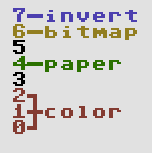
- For each byte – describing six not eight pixels – you can do one of the following:
- Change the ink color. Six pixels of paper color will be displayed in this 6×1 block. Byte contents: 0..7.
- Change the paper color. Six pixels of the new paper color will be displayed. Byte contents: 16..23.
- Display pixels using the current ink (1) and paper color (0). Byte contents: 40h + bitmap in the lower-order bits.
- If bit 7 is on, the block will be displayed in inverted colors. Note that the inversion does not affect the result of ink/paper change operations, only the outlook of the 6×1 block. The inversion logic is a bitwise not:
- black – white, 000 – 111
- red – cyan, 001 – 110
- green – magenta, 010 – 101
- yellow – blue, 011 – 100
- Every new row starts with white ink and black paper.
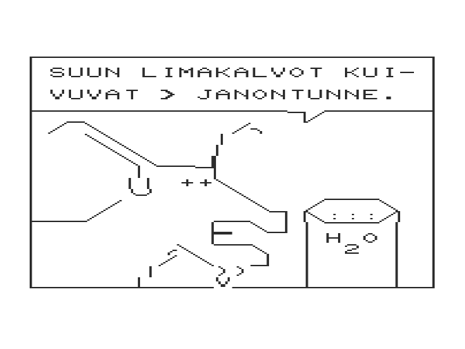
In addition there’s stuff like 50/60 Hz, blinking and text mode setting, but we’ll skip them too. At first the ruleset seems quite simple, but once you actually start thinking of how to do graphics with it, things don’t look that easy anymore. Let’s warm up with a little close-up of a real Oric piccy (“Yessagician” by Dbug):
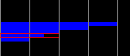
This is the left edge of the screen and the gray lines denote 6 pixel block borders. How would you choose the operations for displaying the pixels – in particular the area I’ve outlined with a red rectangle?
Solutions: the completely black lines we could show as pixels as the line starts with white ink and black paper, but there’s many other possible solutions too. Every black 6×1 block might actually contain an ink change or perhaps setting the paper to black again. Or setting the paper to white and turning the inverse bit on. The 6×1 blue blocks we could create by simply changing the paper to blue, after which the next identical block could contain an optional ink change.
As to the marked area, however, we need to do something else. Changing the paper to blue on the left leaves us with white/blue which will not do for the next block as there are pixels to be displayed. The only possible solution is to turn paper yellow and invert the colors for both of the blocks. An inverted white/yellow pair provides the needed black/blue for the bitmap.
The first two questions I tried to solve were “Is this picture a legal Oric hires image?” and “How to display a legal image using the possible operations?” There’s more to converting a random image to the Oric, but these two problems have to be understood in order to get anywhere. A first bruteforce solution which didn’t even check all the possible combinations took several minutes to solve just one row of a simple image on a recent i5 computer, so clearly something else had to be done.
For each 6×1 block containing one or two colors there can be multiple solutions. Two-color blocks are the easy case: there’s the bitmap and the colors inherited from the left, possibly inverted. One-color blocks are a different ballgame altogether, since they can contain paper changes, invisible ink changes or they might even be a bitmap. All of this with or without inversion, of course. Another difference is that a two-color block needs to get proper colors from the left, whereas a single-color one can be displayed anytime with a paper change.
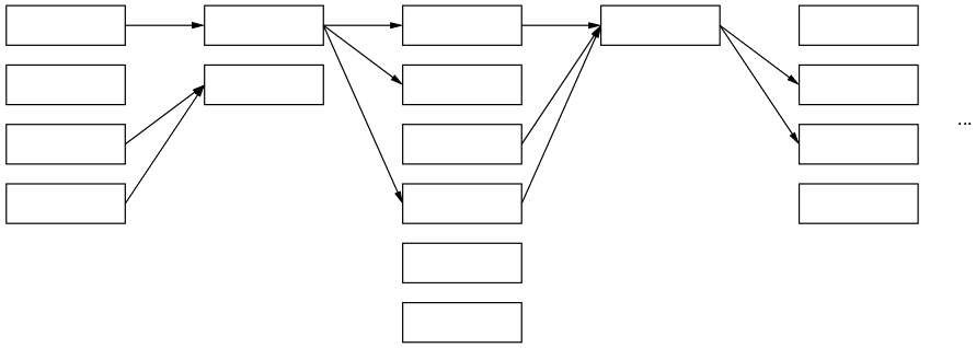
The following image tries to convey a conceptual model of how it works:
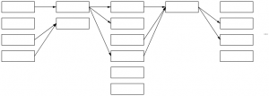
Each column in the graph represents a 6×1 block and its multiple possible solutions. Some could call this a directed acyclic graph. The first block can be displayed in four different ways, the next only in two and so on – in reality the numbers are a lot higher with singe-color blocks. The arrows denote possible movement from left to right: each way of displaying a given block here limits the options for the next block. For example a block which leaves ink/paper as white/black does not provide for its neighbor in need of red color.
Instead of a recursive approach starting from the left and trying out all the possible solutions it is enough to simply loop through the columns, create the links, optionally dropping the dead-ends (solutions leading nowhere on the right or with no supply from the left) and duplicates (same in/out combinations). If there is a path that runs all the way from the left edge to the right, we can conclude that this particular row is legal. More than one path is possible, but that doesn’t really matter. Walking back from right to left we can collect one legit representation for the row, thus solving the two “research questions”.
When it comes to dealing with images that do not comply or converting a random jpeg, I don’t have much to say yet. Different approaches will lead to better or worse approximations – as of now I simply turn offending two-color blocks to single-color ones, but much more could be done. Further reading and examples here:
edit: some first thoughs on dealing with non-conforming images. The first thing I’d try is make a graph with approximate solutions, make the errors the weights of the vertices and use a shortest path algorithm such as Dijkstra’s to find the nearest possible approximation.
edit2: here’s a bit more visual representation of the bits as a bonus.
May 26th, 2016
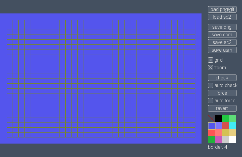
A project I’ve been working on for the last few weeks is now out: Pixel Polizei is a helper tool for the retro artist. The purpose is to let the “graphician” draw using whatever software they happen to like, check/force color clashes and finally save the outcome in native formats that can be viewed using emulators or the real deal. So far there is support for these machines and screen modes:
- Amstrad CPC modes 0 and 1 with or without overscan
- C-64 hires and multicolor
- MSX screen 2
- Oric hires
- Plus/4 hires and multicolor
- ZX Spectrum
More formats and platforms will appear when I find the time and motivation again. As usual, the tool should work on Lin/Mac/Win as long as Java 7 or newer is installed. Open source, too.
May 17th, 2016
Next Posts
Previous Posts